React Native animated bottom modal in a Native Stack Navigator

If you’re using the React Navigation library and you want to show a bottom modal you cannot use the useCardAnimation()
hook to know the state of the transition, this hook is not available in native navigators.
You can implement a gesture-aware bottom modal with a transparent background using the bare minimum:
- RN Animated API
yarn add react-native-gesture-handler
Declare the GModal
in your Native Stack navigator. If you plan to have multiple modals feel free to include all of them in <RootStack.Group>
. All the screenOptions
values will automatically be passed down to all of the children.
<RootStack.Navigator> | |
<RootStack.Screen name="other-screen" component={OtherScreen} /> | |
<RootStack.Group | |
screenOptions={{ | |
presentation: 'containedTransparentModal', | |
animation: 'slide_from_bottom', | |
}}> | |
<RootStack.Screen name="g-modal" component={GModal} /> | |
</RootStack.Group> | |
</RootStack.Navigator> |
Create a new GModal.tsx
file and let’s start with some imports.
import React, { useCallback } from 'react'; | |
import { Animated, View } from 'react-native'; | |
import { | |
HandlerStateChangeEvent, | |
PanGestureHandler, | |
} from 'react-native-gesture-handler'; |
Add a root view.
return ( | |
<View | |
style={{ | |
flex: 1, | |
backgroundColor: 'blue', | |
justifyContent: 'flex-end', | |
}}> | |
{/* | |
this view will cover the entire screen | |
when the modal is presented | |
*/} | |
</View> | |
); |
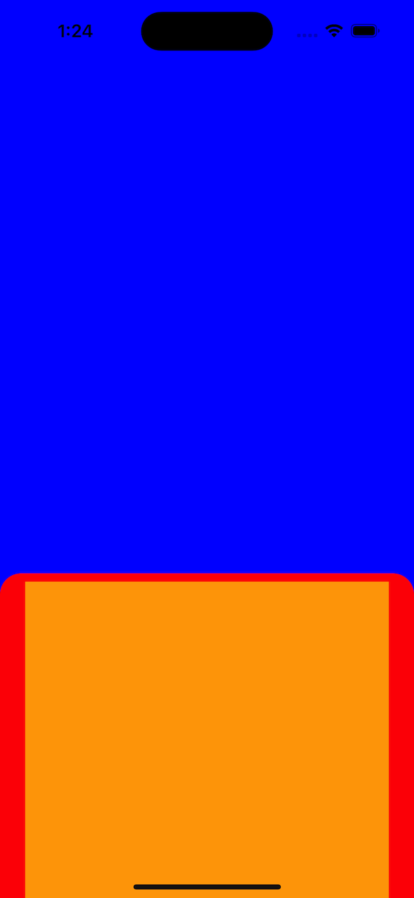
Add a <PanGestureHandler>
with an animated content view, this <Animated.View>
will be translated on Y axis using the gesture data provided by the PanGestureHandler.
return ( | |
<View | |
style={{ | |
flex: 1, | |
backgroundColor: "blue", | |
justifyContent: "flex-end", | |
}} | |
> | |
<PanGestureHandler> | |
<Animated.View | |
style={[ | |
{ | |
borderTopStartRadius: 20, | |
borderTopEndRadius: 20, | |
backgroundColor: "red", | |
paddingTop: 8, | |
paddingHorizontal: 24, | |
justifyContent: "center", | |
alignItems: "center", | |
}, | |
]} | |
> | |
<View | |
style={{ width: "100%", height: 300, backgroundColor: "orange" }} | |
/> | |
</Animated.View> | |
</PanGestureHandler> | |
</View> | |
); |
Declare a variable to hold the current Y value and some functions that will be called by the PanGestureHandler.
// Gesture's Y axis value, will be used to animate our content view; up and downd. | |
const translateY = React.useRef(new Animated.Value(0)).current; | |
// This will be fired at least 60 times per second with an event containing | |
// gesture location data including the new Y axis value. | |
const onPanGestureEvent = Animated.event( | |
[ | |
{ | |
nativeEvent: { | |
translationY: translateY, | |
}, | |
}, | |
], | |
{ useNativeDriver: true } | |
); | |
const closeModal = useCallback(() => { | |
navigation.goBack(); | |
}, [navigation]); | |
// Called when the user lifted his finger from the screen. | |
const onPanGestureEnd = useCallback( | |
(event: HandlerStateChangeEvent) => { | |
// If the user swiped down more than 150 points, close the modal. | |
if (event.nativeEvent.translationY > 150) { | |
closeModal(); | |
return; | |
} | |
// This is optional, you can try to see how it looks without it. | |
Animated.spring(translateY, { | |
toValue: 0, | |
useNativeDriver: true, | |
friction: 5, | |
tension: 10, | |
}).start(); | |
}, | |
[closeModal, translateY] | |
); | |
return ( | |
<View | |
style={{ | |
flex: 1, | |
backgroundColor: "blue", | |
justifyContent: "flex-end", | |
}} | |
> | |
<PanGestureHandler | |
onEnded={onPanGestureEnd} | |
onGestureEvent={onPanGestureEvent} | |
> | |
<Animated.View | |
style={[ | |
{ | |
borderTopStartRadius: 20, | |
borderTopEndRadius: 20, | |
backgroundColor: "red", | |
paddingTop: 8, | |
paddingHorizontal: 24, | |
justifyContent: "center", | |
alignItems: "center", | |
}, | |
{ | |
transform: [ | |
{ | |
translateY: translateY, | |
}, | |
], | |
}, | |
]} | |
> | |
<View | |
style={{ width: "100%", height: 300, backgroundColor: "orange" }} | |
/> | |
</Animated.View> | |
</PanGestureHandler> | |
</View> | |
); |
Take a look and play a bit with this.
Let’s change the blue background, in the root view replace the blue
value with transparent
and you will see the content beneath.
If you open the modal and drag it up as much as you can, at the bottom of the modal, because it’s transparent you can see the parent’s page content.
Let’s create a new component to fix this.
const GBottomInfiniteView = React.memo(({ translateY }: any) => { | |
return ( | |
<Animated.View | |
style={[ | |
{ | |
zIndex: 0, | |
position: 'absolute', | |
width: '100%', | |
height: 1000, // it can be any big value | |
backgroundColor: 'purple', // change it to `white` after you saw it on your device | |
}, | |
{ | |
transform: [ | |
{ | |
translateY: translateY.interpolate({ | |
inputRange: [0, 1000], | |
outputRange: [1000, 2000], | |
}), | |
}, | |
], | |
}, | |
]} | |
/> | |
); | |
}); |
This component will be placed as the last child in the root view:
return ( | |
{/* [...] */} | |
</PanGestureHandler> | |
<GBottomInfiniteView translateY={translateY} /> | |
</View> | |
); |
Add a drop shadow for our content view so we can see the edges more clearly.
{/* [...] */} | |
<Animated.View | |
style={[ | |
{ | |
backgroundColor: 'white', | |
paddingTop: 8, | |
paddingHorizontal: 24, | |
justifyContent: 'center', | |
alignItems: 'center', | |
// ios shadow | |
shadowColor: '#101010', | |
shadowOffset: { width: 4, height: 8 }, | |
shadowOpacity: 0.25, | |
shadowRadius: 12, | |
// android shadow | |
elevation: 12, | |
}, | |
{ | |
transform: [ | |
{ | |
translateY: translateY, | |
}, | |
], | |
}, | |
]}> | |
<View | |
style={{ width: '100%', height: 300, backgroundColor: 'red' }} | |
/> | |
</Animated.View> | |
{/* [...] */} |
It’s cool to swipe it down to close it but we also want the modal to be dismissed if we click on the transparent background. Add a <Pressable>
to intercept some click events and link it to the already defined closeModal()
function.
import { Pressable } from 'react-native'; | |
// [...] | |
return ( | |
<Pressable onPress={closeModal} style={{ flex: 1 }}> | |
<View | |
style={{ | |
flex: 1, | |
backgroundColor: 'transparent', | |
justifyContent: 'flex-end', | |
}}> | |
<PanGestureHandler | |
{*/ [...] */} |
One problem here. If you click on the red view, the onPress
will be called and the modal will be closed, if you don’t want this, make sure to add another <Pressable>
over <PanGestureHandler>
.
// [...] | |
return ( | |
<Pressable onPress={closeModal} style={{ flex: 1 }}> | |
<View | |
style={{ | |
flex: 1, | |
backgroundColor: 'transparent', | |
justifyContent: 'flex-end', | |
}}> | |
<Pressable> | |
{*/ This 👆 Pressable will take in all the touch events happening inside. */} | |
<PanGestureHandler | |
onEnded={onPanGestureEnd} | |
onGestureEvent={onPanGestureEvent}> | |
{*/ [...] */} |
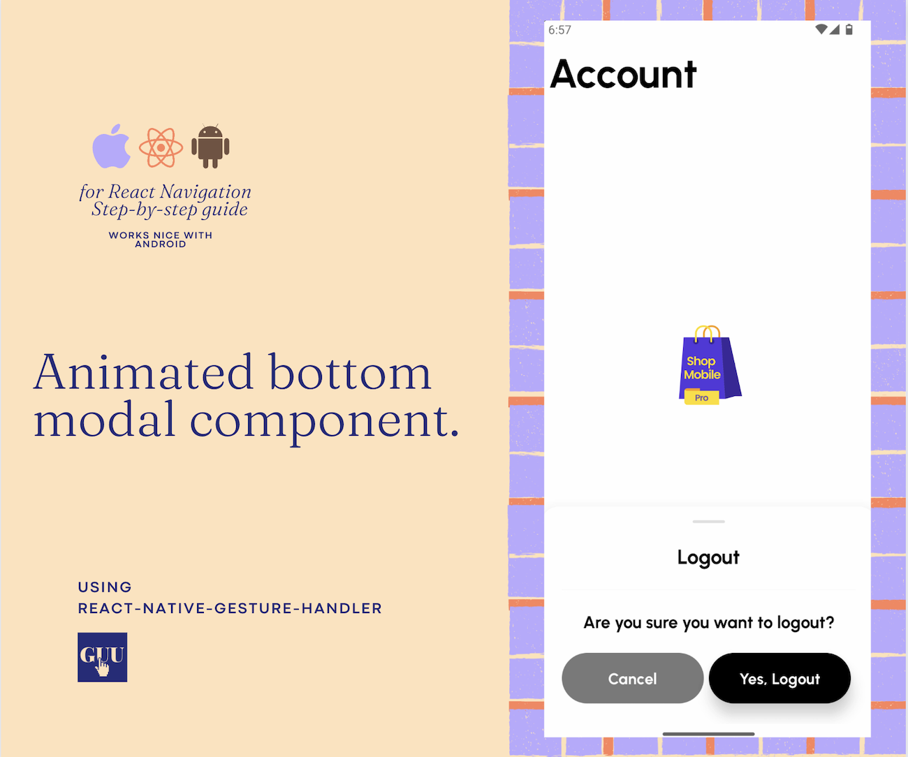
You’re pretty much done! Watch this short demo with a polished Logout Modal on Android.
Check out the full implementation here.
Feel free to write your question in the comments section bellow. 👇

Comments